Lovely. So much better. The flowers stand out more. There is more unity between flower and background in that the highlights fall in the same place. Before there was nearly a conflict between background and flower which showed neither at thier best...now there's a unity, yet each can command one's attention in turn. Terrific
Diane, Anne said it so well. Now the flowers stand so beautifully against the beautiful blue background. They look like lovely modern Audubon paintings. This really did it. The paintings are gorgeous.

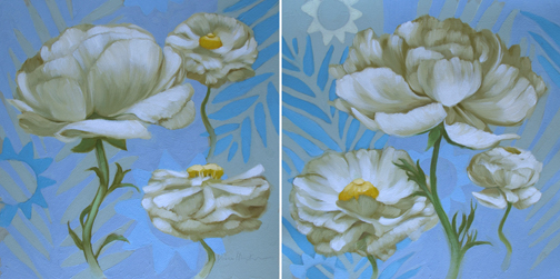
Lovely. So much better. The flowers stand out more. There is more unity between flower and background in that the highlights fall in the same place. Before there was nearly a conflict between background and flower which showed neither at thier best...now there's a unity, yet each can command one's attention in turn.
ReplyDeleteTerrific
Diane, Anne said it so well. Now the flowers stand so beautifully against the beautiful blue background. They look like lovely modern Audubon paintings. This really did it. The paintings are gorgeous.
ReplyDeleteIt's interesting to see the different phases of your paint-in-progress. I actually like them both!
ReplyDelete